ETUDE ME
A made-to-measure web application for an LGBT-focused clothing line.
Role: UX/UI Designer
-
UX Research
-
Design Strategy
-
Product Strategy
-
UI Design
-
Project Management
OVERVIEW
ETUDE ME is a web application with the vision of finding an alternative innovative sizing solution. This made-to-measure and made-to-order clothing web application is focused on making e-commerce an enjoyable process for LGBT fashion lovers and people who have not been served well by the fashion industry.
The goal of this ongoing project is to visualize the beginning parts of this process and identify any usability issues for this unique and complicated made-to-measure clothing line. This project will help us determine the critical features to prioritize for the next iteration of the product.
Summary
Fashion is personal, real, raw, and a means to express individuality. Fashion can be utilized to spark conversation in relation to the injustices that are happening within our modern societies today and can be very well positioned to lead on diversity and inclusion.
Etude Me's mission and mandate is to redesign processes and systems to prioritize diversity and inclusion, and help sustain our future world, rather than destroy it.
Understanding the Problem
-
Sizing, Fit, and Global Warming: All the national and international attempts to standardize sizes by the fashion industry had failed, because there's no "standard body". Standardized sizing emerged as a way to cut costs, but was plagued with problems from the beginning as the data gathered represented only a segment of the market, leaving others behind. Even though technology has become more sophisticated than tape measure since then, finding the right fit is still a real struggle, navigating buying clothes that actually fit infinitely harder.
-
Lack of Accurate Representation: The fashion industry is very binary and regardless of the recent affords made in the forms of rainbow capitalism, it has failed to lead to trans and nonbinary inclusion. Since not everyone identifies as male or female and brands providing only Menswear and Womenswear as the only category options lead to the isolation of the gender expansive and gender nonconforming individual.
The Solution
Designing a made-to-measure and made-to-order process as an alternative, innovative, solution for the existing sizing and fit crises and incorporating an AI mobile scanning solution and virtual try-on fitting rooms for a user-centric experience that eliminates overproduction and unnecessary textile waste, minimizes returns, and drastically cuts carbon emissions. The product aims to serve the underserved market segments that have been left out and neglected for years by the fashion industry including but not limited to nonbinary people who feel unable to wear work attires that accurately represent their gender expression (32% of the market) and the plus sizes (21% of the market).
Target Audience
People who care about garments fit and quality, consumers who are willing to shop more with brands that incorporate technology augmented reality, and the LGBT community.
Market & UX Research
The Goal:
To successfully launch an e-commerce business, we needed a deep understanding of people's needs, shopping behaviors, and frustrations with buying clothes. To gather insights, I designed and conducted a comprehensive survey using Google Suite. I strategically distributed it through San Francisco’s LGBT centers, in neighborhoods with high LGBT populations, related slack channels, and via my social media platforms. This approach ensured that we captured relevant, diverse perspectives directly from our target audience, helping us shape a more inclusive and user-centered shopping experience.


Extracting Insights
Valuable insights were gained from the research I conducted through social media platforms like Instagram and Facebook. The data collected provided a mix of qualitative and quantitative insights directly from my target audience. These findings gave us a much clearer understanding of who is interested in our products and services and why, as well as what features and offerings would best meet their needs. This research allowed us to fine-tune the service design to better align with our audience's expectations and preferences.

Then by analyzing the data, I was able to better identify patterns, pain points, and preferences, which inform my design decisions and ensure the product addresses real user challenges, ultimately creating a more intuitive and user-centered product.
User Persona
Based on all the market research and the survey responses I created 2 different personas.


In addition to the survey and after coming up with my persona, I started a competitive market analysis to find out what's already out there and learn what's ultimately available in the current market.

The Site Map
I had some answers from our previous survey and now it was time to start putting it together into a cohesive end-to-end flow. I created some user flows based on some potential user stories and made a low-fi map of the stages of the decision-making process as I currently understood them

The User Flow


Low Wireframes & User Testing
I created digital wireframes using the final sketches referring to the user flows. Then I asked both professionals in the fashion industry and people from my target audience to do a usability test for me.


And here are some User Testing feedback and insights that I took with me when moving to the High Fi prototype:
-
The hamburger menu is not user-friendly
-
Too many category items
-
The drop-down menu is confusing and not intuitive
-
More information on the Homepage is needed
-
Work on negative space and layout
-
It makes more sense to find a way to combine the garment style, fabric options, and color options together
-
Too many options are not necessarily good
-
Want to know about the fabrics but also don't like reading too much information
Brand Development
The branding for this project was important – as a new service asking people to sign up to get a free fabric swatch and help them with committing to ordering a garment instead of buying it off of a rack we needed to inspire them with what we believe in and also project a trustworthy face to our potential clients while reflecting our community & sustainability-oriented values. So I started this process by brainstorming some potential logo ideas:
Logo Exploration & Refinments
I started the process by thinking about how to incorporate the rainbow into the brand logo but eventually decided to break away from that and move more towards a more minimalistic fashion-forward approach.

Color Pallet & Mood Board
We think of the color purple as the color of royalty and luxury and that by itself can bring up feelings of reliability and trust. But besides all that I chose the color violet because of this historical reference to the famous poet, Sappho. In one of her poems, she mentions her lover wearing violet flowers on her head or neck and this image is eternally linked with female desires and what is also called Sapphic love.
And the yellow represents hope and optimism, what we all need these days more than ever.

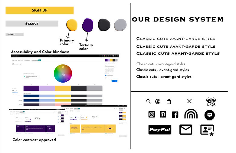
Accessibility
Accessibility was a very crucial aspect of our design process since our goal is to make our product available to as many users as possible and work around their limitations. To test the accessibility of my designs, I used Adobe Color. All texts and icons received an AAA or AA pass for color contrast, and all colors are considered to be color-blind safe. I'm going to work on adding a speech-to-text option to this prototype.


Conclusion
The 4-week agile sprint I spent as a UX/UI designer on an unreleased product was a valuable learning experience with a steep learning curve. It reinforced the importance of staying lean and strategically focusing my energy where it matters most. Given more time, I would have loved to enhance the "How It Works" section on the homepage with custom illustrations to make the user journey even more engaging.
Some key takeaways from this project include:
-
Prioritizing an MVP: With limited time and resources, it's crucial to focus on features that deliver the most value to users, ensuring that the core functionality is solid.
-
Big-picture thinking: Avoid getting lost in the details. Taking a step back to reassess user flows helped me reprioritize the UX and focus on what's most impactful.
-
Staying user-focused: Remembering that solving users' problems is the primary goal. It's easy to lose sight of this when managing every aspect of the project alone, but keeping user pain points at the forefront is essential for success.
This experience taught me to balance efficiency with quality, staying adaptable throughout the design process.